
Customizing the septic tank catalog in CS-Cart for Bioseptikon.ru
An online store for septic tanks and engineering equipment.
Bioseptikon.ru sells septic tanks, cesspits, cellar tanks, and related products. The catalog includes many similar models, where the choice depends on variations, drainage type, installation, and technical specifications. The goal was to make product cards more informative without forcing users to open the product page.

Client goal
Make the catalog useful for choosing a complex product before opening the product card
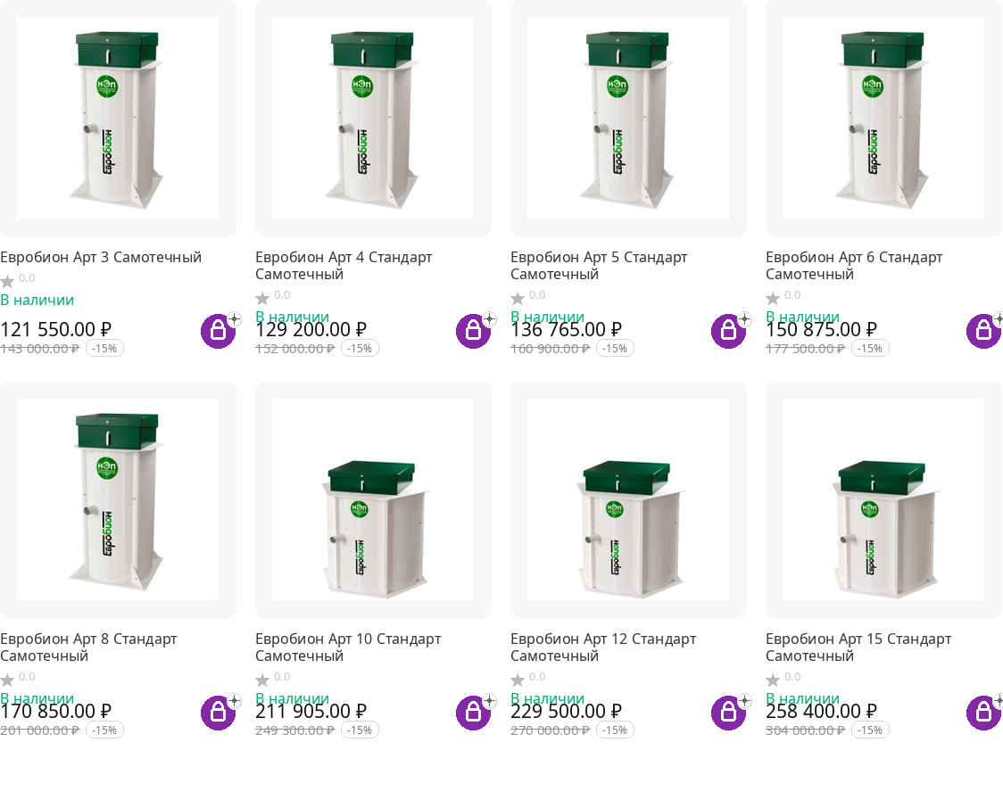
In the default UniTheme2 grid, the buyer saw a photo, name, price, and add-to-cart button. For septic tanks, that is not enough: one model can have different drainage types, modifications, installation options, pipe depth, and other characteristics. The task was to display this data in the listing and keep a convenient buying flow on desktop and mobile devices.
Tasks
- customize the catalog grid in the desktop version
- add variation switch buttons directly inside the product card
- show features with values and icon support
- add a “Choose options” button at the bottom of the product card
- adapt the same flow for the mobile product list
- show features in the option-selection popup and expand options on the mobile product page
What I did
Expanded the product card in the catalog and connected it to CS-Cart variations
Desktop grid
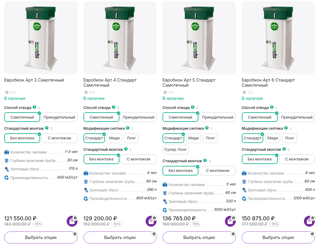
For desktop, I kept the “Grid” view in UniTheme2 and added variation switches, technical features, and a bottom option-selection button to the card.
Mobile catalog
For mobile, I used the “List without options” view: an “Options” button appeared next to the cart, while features and variations remained available without overloading the card.
Features with icons
I displayed user count, pipe depth, surge capacity, performance, and other parameters, with the ability to attach icons to features.
Variation linkage
When a variation is switched, the feature values change too. For septic tanks, this is especially important for pipe depth.
Unified options popup
The “Add to cart,” “Choose options,” and “Options” buttons all open the same selection flow. The popup also shows product features.
Mobile product page
On the product page, I added a “Show options” button so the buyer can manage variations without a long block taking over the screen immediately.
UI-UX
The product card became a decision-making tool, not just a price display
Before the customization, the user saw a standard compact grid. After the changes, the card shows variations, key parameters, and a dedicated action for selecting options. This reduces unnecessary navigation and helps compare similar models directly in the category.
What the client got
The main result is that buyers can understand the differences between models faster and choose the right configuration without extra clicks. For a technical product catalog, that directly improves comparison and lead quality.
How to prepare a UniTheme2 customization without unnecessary rework
If you want to understand it yourself first: what should be shown in the catalog card, which CS-Cart and UniTheme2 capabilities to check before development, and what must be tested on mobile.
Frequently asked questions
Can the UniTheme2 catalog card be customized without replacing the whole template?
Yes. If the task is about showing variations, features, buttons, and popups, targeted changes to templates, JS, and CS-Cart PHP logic are usually enough.
How can you show features with icons in the catalog card?
You need to define the set of features for the listing, prepare the value output, and add the icon binding. The important part is not to bring every product property into the card, but only the parameters that help choose the model.
What is important when switching variations in the product list?
The card should update not only the price and the buy button, but also the characteristics of the selected variation. Otherwise, the user sees one product variant while the parameters remain from another.
Can the same option-selection window be opened from different buttons?
Yes. In this case, the “Add to cart,” “Choose options,” and “Options” buttons all lead to the same flow so the user does not end up in different configuration interfaces.
Why should the mobile catalog version be customized separately?
A mobile screen has less space. What works well in a desktop grid can overwhelm a product list. That is why the mobile version needs separate buttons, compact feature output, and expandable blocks.
LET’S GET STARTED
Describe the project — we’ll estimate it within 24 hours
We’ll tell you whether it is feasible, how long it may take, and what it may cost. Free and without obligation.
- Fixed price before work starts
- An agreement for each project
- Results warranty